See full brand guide for usage guidance regarding each of these brand elements. Click to access master artwork of each element.
PRIMARY LOGO
TAGLINE
LOGO + TAGLINE
SYMBOL
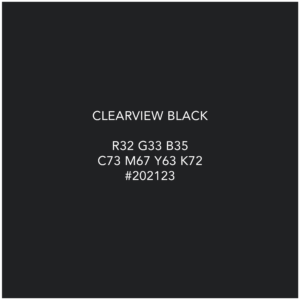
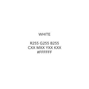
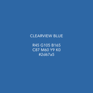
We use ClearView black and white generously across all our branded materials. They are the foundational colors of the brand that makeup our canvas. Blue is our highlight color that brings layouts to life. See full brand guide for usage guidance.
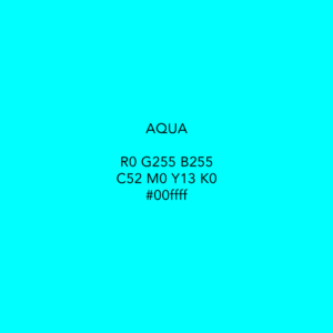
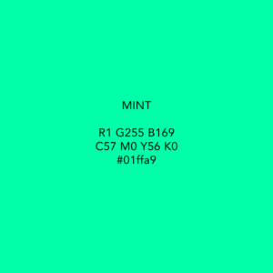
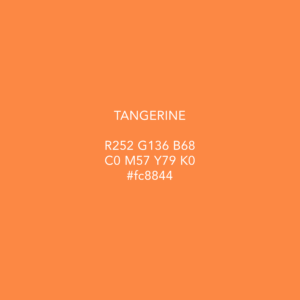
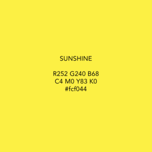
Secondary Color Pallet
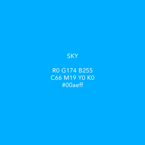
ClearView’s secondary color pallet is full of vibrant colors used to bring excitement and highlight elements in creating marketing material. These should be used with discretion. See full brand guide for usage guidance.
See full brand guide for usage guidance on ClearView’s functional vs. brand icons. Click to access full catalogue of approved icons.
We use a variety of imagery to add interest to marketing content. Contact center workplace imagery should take precedence over most other imagery options and should be the primary focus if imagery is being used in any marketing content. See more usage guidance in the brand guide. Click to access a folder of each type of approved imagery.
Templates
To unify the ClearView brand, we have provided templates for various applications to make any external facing content in line with ClearView brand standards. Please save all finalized docs to the Sharepoint file linked below.


